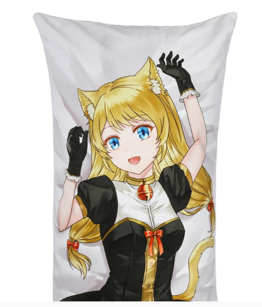
Designing for a large-scale format presents a unique set of challenges that differ significantly from standard digital illustration. When you are creating art for a Dakimakura, you aren’t just making a picture; you are designing a life-sized product that will be scrutinized up close by collectors and fans. To ensure your final product looks as professional as possible, you must master several technical and artistic hurdles. Whether you are an artist looking to sell your work or a fan commissioning a piece, here are the best tips for designing a high-quality custom body pillow.
1. Prioritize Extreme Resolution and DPI
The most common mistake in Dakimakura design is working with a canvas that is too small. Because a body pillow is typically 150cm to 160cm long, any low-resolution art will appear blurry or “pixelated” once printed on fabric.
- The Golden Rule: Your canvas should be at least 5000 x 1600 pixels. However, many professional artists prefer to work at 7000 x 2500 pixels to allow for extra detail.
- DPI (Dots Per Inch): Always set your file to 300 DPI. While screens display at 72 DPI, textile printers require much higher density to ensure that the ink creates smooth gradients and sharp lines. Printing a 72 DPI image on a large fabric surface will result in visible “noise” and jagged edges.
2. Understand the “Bleed” and “Safe” Zones
When a custom body pillow is manufactured, the fabric is printed first and then sewn together. This means that any vital part of your design that is too close to the edge might be lost in the seam or cut off during the trimming process.
- The Bleed Area: Add an extra 2-3 centimeters of background color or pattern beyond the intended dimensions of the pillow. This “bleed” ensures that if the fabric shifts slightly during sewing, there won’t be an awkward white gap at the seam.
- Safe Zone: Keep critical details—like the character’s eyes, signatures, or intricate accessories—at least 5cm away from the edge. This prevents them from being obscured by the curve of the pillow once it is stuffed.
3. Manage Your Color Profiles (CMYK vs. RGB)
Most digital artists work in RGB because it offers a wider range of vibrant colors on screen. However, industrial textile printers use CMYK (Cyan, Magenta, Yellow, and Key/Black).
If you design a neon-bright character in RGB and send it straight to a printer, the final custom body pillow may look duller or “muddy” compared to your monitor. To avoid this:
- Work in a CMYK color space if your software allows it.
- If you must work in RGB, use “Gamut Warning” tools to identify colors that cannot be replicated in print.
- Always perform a color test or request a small fabric swatch if you are producing a large batch.
4. Design for the “3D” Curve
A Dakimakura is not a flat poster; it is a cylindrical object once stuffed. This means that the sides of your drawing will wrap around the edges of the pillow.
- Composition: Avoid placing important visual information on the far left or far right of the canvas, as these will be the most distorted areas.
- Anatomy: If you are drawing a character, pay attention to how their limbs interact with the edges. A limb that looks perfectly fine on a flat screen might look “broken” or unnaturally bent once it wraps around the side of a stuffed pillow.
5. Focus on Line Weight and Cleanliness
Textile printing, especially on premium 2-Way Tricot, is incredibly unforgiving when it comes to “sketchy” lines. Because the viewer will be holding the pillow close to their face, every stray mark or unrefined brushstroke will be visible.
- Line Art: Use clean, high-stabilization brush settings for your line work. Tapered lines that vary in thickness add a sense of professional “depth” to the character.
- Shading: Avoid “soft” airbrushing for everything. Mixing “cell shading” (hard edges) with soft gradients creates a more dynamic and professional look that survives the printing process better than a blurry, low-contrast image.
See also: Custom Pen Boxes That Make a Lasting Impression by Hola Custom Boxes
6. Contrast and Saturation
Fabric tends to “absorb” a bit of the visual impact of an image. Dark areas can sometimes bleed together, losing detail, while very light areas might wash out.
- Punch Up the Saturation: Generally, increasing your saturation by 5-10% more than you think you need will help the colors look “right” once they are on the fabric.
- Value Checking: Turn your design to grayscale temporarily. If you can’t distinguish the character from the background in black and white, the contrast is too low. High contrast ensures that the custom body pillow looks striking even from across the room.
7. The Importance of Background Design
While the character is the star, the background shouldn’t be an afterthought. A solid white background can look “cheap,” while a black background can show lint and dust more easily.
Consider using:
- Subtle gradients that complement the character’s color scheme.
- Light patterns (like stars, petals, or geometric shapes) that add texture without distracting from the main subject.
- “Themed” backgrounds that match the character’s lore or personality.
Conclusion
Creating a high-quality Dakimakura is a balancing act between artistic talent and technical precision. By respecting the 300 DPI standard, accounting for the “3D” wrap of the fabric, and carefully managing your color profiles, you ensure that your custom body pillow is more than just a novelty—it becomes a high-end collector’s item.
Remember, the quality of the print is a direct reflection of the quality of the file. Take the extra time to refine your lines, check your bleed zones, and push your resolution to the limit. The result will be a vibrant, crisp, and professional piece of art that looks just as good on the bed as it does on the screen.